G-IN
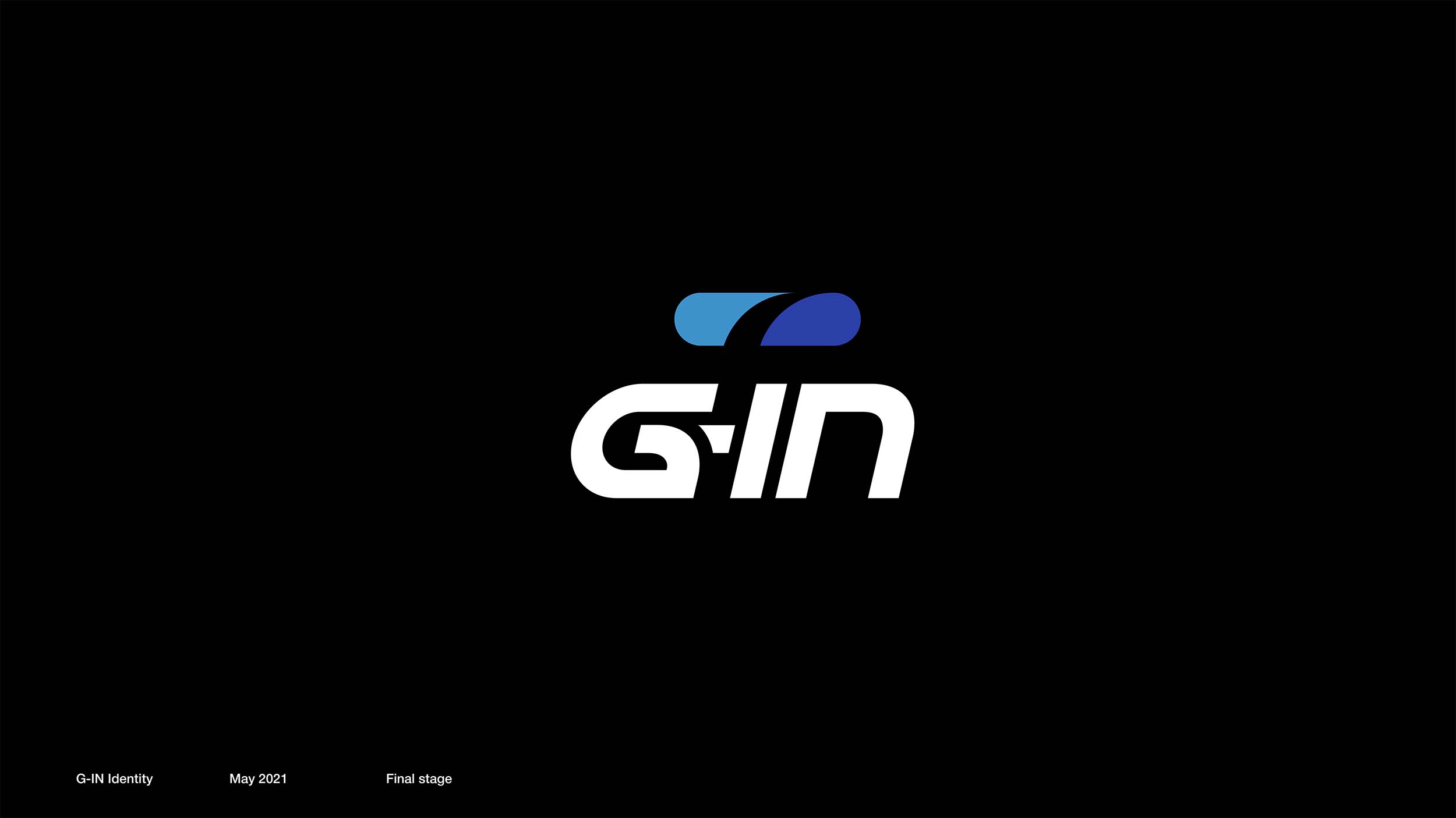
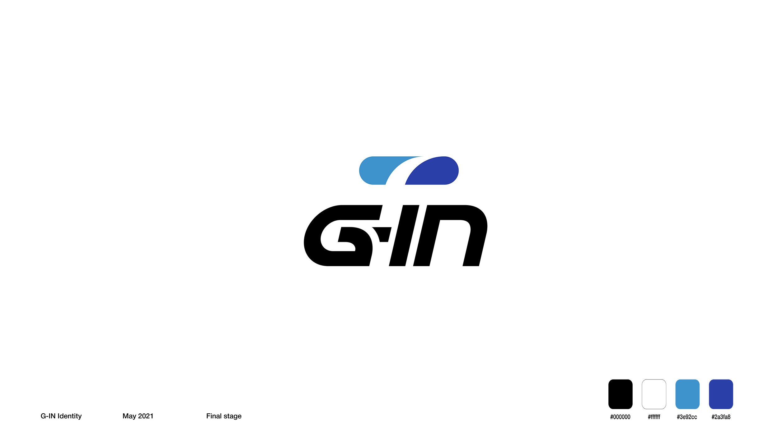
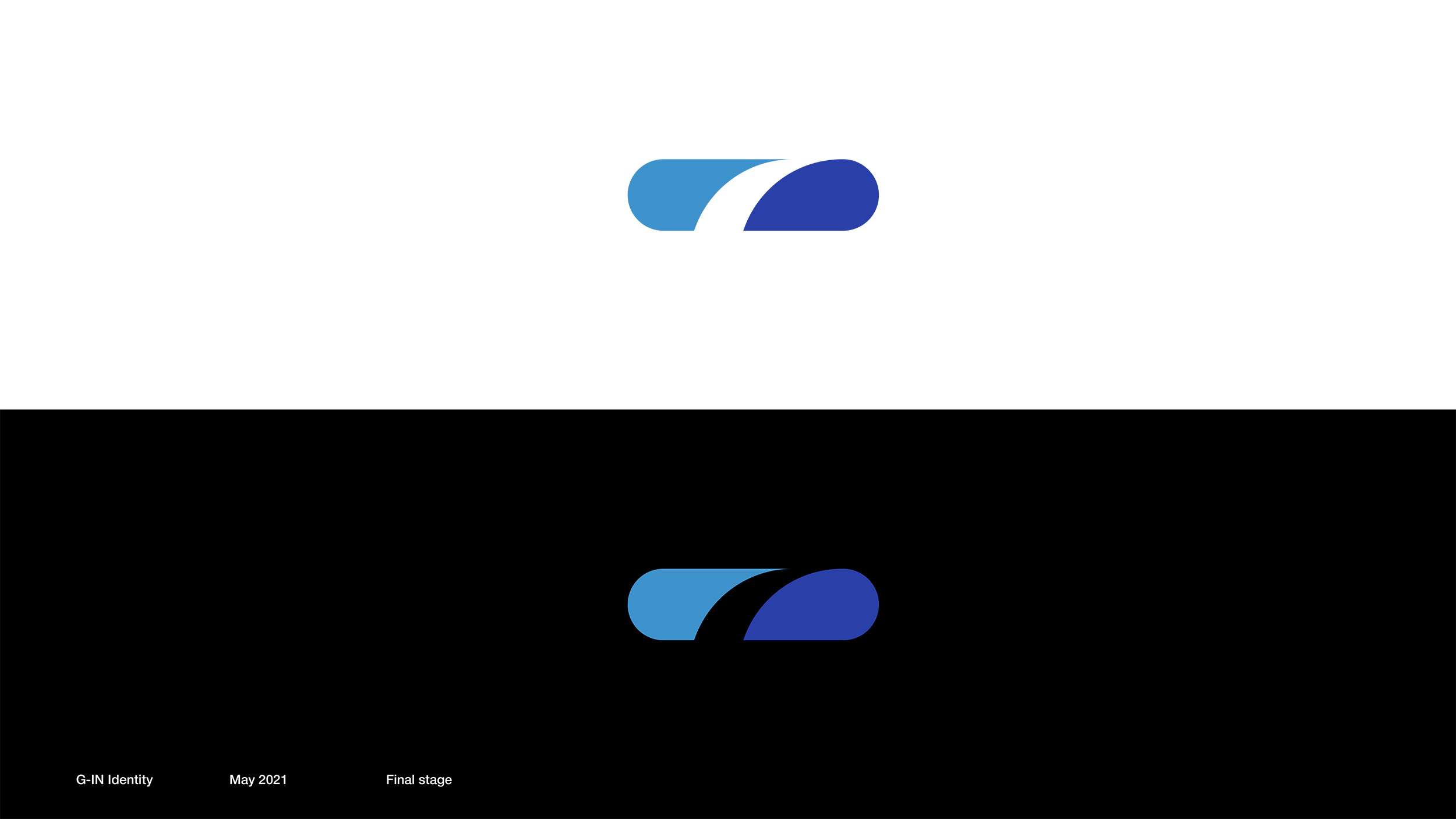
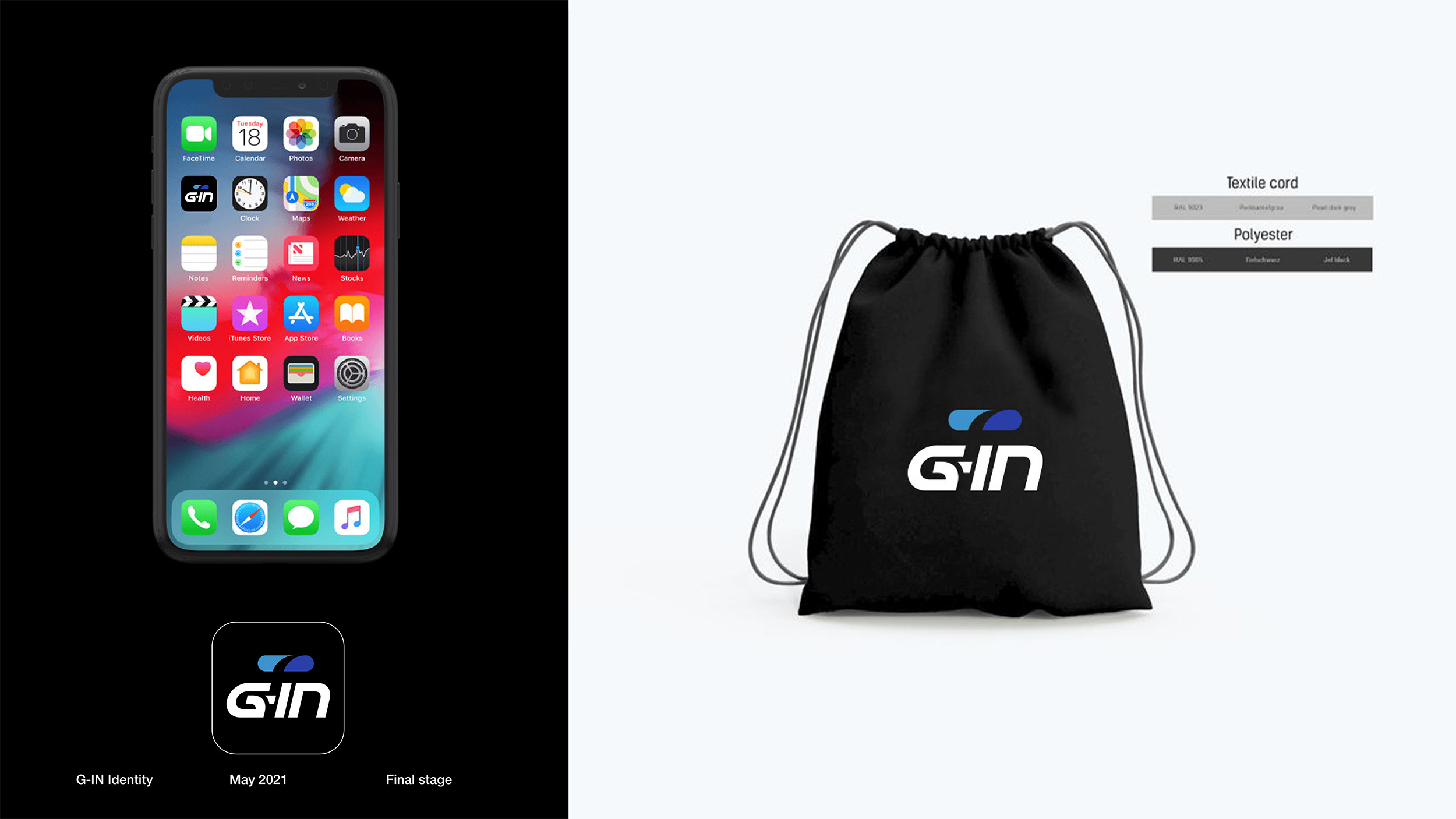
The G-IN logo features a clean and modern design in a bold and elegant typography. The standout element of the logo is a simple yet impactful icon of a pill. The use of the pill as the icon symbolizes the idea of “treatment” or “medicine” for better health.
The concept behind the logo is to convey the message that incorporating sports and physical activity into one’s lifestyle can be as essential as medicine in achieving a healthier and happier life. The pill icon represents the notion that exercise and sports act as a form of preventive and therapeutic treatment, contributing to overall well-being and promoting a healthier lifestyle.


